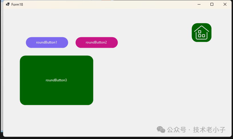
在WinForms开发中,默认的Button控件外观比较单调,且圆角效果显示质量较差。本文将介绍如何使用GDI+创建一个高质量的自定义圆角按钮控件。
这个控件参考了油管一个大神的写法,确实用的技术一样,双层绘制机制是重点,他写的确实漂亮!!!
主要特性
可自定义边框大小
可自定义圆角半径
可自定义边框颜色
支持背景色和文本颜色设置
平滑的圆角渲染效果
实现步骤
创建自定义按钮类
首先创建一个继承自Button的自定义类:
using System.Windows.Forms;
using System.Drawing;
using System.Drawing.Drawing2D;
using System.ComponentModel;

public class RoundButton : Button
{
    // 字段定义
    private int borderSize = 0;
    private int borderRadius = 20;
    private Color borderColor = Color.PaleVioletRed;
}
添加属性
为按钮的自定义特性添加属性:
[Category("Round Button")]
public int BorderSize
{
    get => borderSize;
    set
    {
        borderSize = value;
        Invalidate();
    }
}

[Category("Round Button")]
public int BorderRadius
{
    get => borderRadius;
    set
    {
        borderRadius = value;
        Invalidate();
    }
}

[Category("Round Button")]
public Color BorderColor
{
    get => borderColor;
    set
    {
        borderColor = value;
        Invalidate();
    }
}

[Category("Round Button")]
public Color BackgroundColor
{
    get => BackColor;
    set => BackColor = value;
}

[Category("Round Button")]
public Color TextColor
{
    get => ForeColor;
    set => ForeColor = value;
}
构造函数实现
设置按钮的默认外观:
public RoundButton()
{
    FlatStyle = FlatStyle.Flat;
    FlatAppearance.BorderSize = 0;
    Size = new Size(150, 40);
    BackColor = Color.MediumSlateBlue;
    ForeColor = Color.White;
    Resize += new EventHandler(Button_Resize);
}

private void Button_Resize(object sender, EventArgs e)
{
    if (borderRadius > Height)
        borderRadius = Height;
}
圆角路径生成
实现圆角图形路径的生成方法:
private GraphicsPath GetFigurePath(Rectangle rect, float radius)
{
    GraphicsPath path = new GraphicsPath();
    float curveSize = radius * 2F;

    path.StartFigure();
    // 左上角
    path.AddArc(rect.X, rect.Y, curveSize, curveSize, 180, 90);
    // 右上角
    path.AddArc(rect.Right - curveSize, rect.Y, curveSize, curveSize, 270, 90);
    // 右下角
    path.AddArc(rect.Right - curveSize, rect.Bottom - curveSize, curveSize, curveSize, 0, 90);
    // 左下角
    path.AddArc(rect.X, rect.Bottom - curveSize, curveSize, curveSize, 90, 90);
    path.CloseFigure();

    return path;
}
重写OnPaint方法
实现按钮的绘制:
protected override void OnPaint(PaintEventArgs pevent)
{
    base.OnPaint(pevent);
    Rectangle rectSurface = ClientRectangle;
    Rectangle rectBorder = Rectangle.Inflate(rectSurface, -borderSize, -borderSize);
    int smoothSize = 2;

    if (borderSize > 0)
        smoothSize = borderSize;

    if (borderRadius > 2) // 圆角按钮
    {
        using (GraphicsPath pathSurface = GetFigurePath(rectSurface, borderRadius))
        using (GraphicsPath pathBorder = GetFigurePath(rectBorder, borderRadius - borderSize))
        using (Pen penSurface = new Pen(Parent.BackColor, smoothSize))
        using (Pen penBorder = new Pen(borderColor, borderSize))
        {
            pevent.Graphics.SmoothingMode = SmoothingMode.AntiAlias;
            // 按钮表面
            Region = new Region(pathSurface);
            // 绘制表面边框
            pevent.Graphics.DrawPath(penSurface, pathSurface);
            // 按钮边框
            if (borderSize >= 1)
                pevent.Graphics.DrawPath(penBorder, pathBorder);
        }
    }
    else // 普通按钮
    {
        pevent.Graphics.SmoothingMode = SmoothingMode.None;
        // 按钮表面
        Region = new Region(rectSurface);
        // 按钮边框
        if (borderSize >= 1)
        {
            using (Pen penBorder = new Pen(borderColor, borderSize))
            {
                penBorder.Alignment = PenAlignment.Inset;
                pevent.Graphics.DrawRectangle(penBorder, 0, 0, Width - 1, Height - 1);
            }
        }
    }
}
处理父容器颜色变化
为确保按钮在父容器颜色变化时正常显示:
protected override void OnHandleCreated(EventArgs e)
{
    base.OnHandleCreated(e);
    Parent.BackColorChanged += Container_BackColorChanged;
}

private void Container_BackColorChanged(object sender, EventArgs e)
{
    Invalidate();
}
双层绘制机制
外层路径(pathSurface):定义按钮的整体形状
内层路径(pathBorder):定义边框的位置 代码说明一下。
protected override void OnPaint(PaintEventArgs pevent)
{
    base.OnPaint(pevent);
    // 获取按钮的客户区矩形
    Rectangle rectSurface = ClientRectangle;
    // 根据边框大小计算内层矩形
    Rectangle rectBorder = Rectangle.Inflate(rectSurface, -borderSize, -borderSize);
    int smoothSize = 2;
    if (borderSize > 0)
        smoothSize = borderSize;

    if (borderRadius > 2) // 圆角按钮
    {
        using (GraphicsPath pathSurface = GetFigurePath(rectSurface, borderRadius))          // 外层路径
        using (GraphicsPath pathBorder = GetFigurePath(rectBorder, borderRadius - borderSize))  // 内层路径
        using (Pen penSurface = new Pen(Parent.BackColor, smoothSize))                      // 外层画笔
        using (Pen penBorder = new Pen(borderColor, borderSize))                            // 边框画笔
        {
            pevent.Graphics.SmoothingMode = SmoothingMode.AntiAlias;
            // 1. 设置按钮区域
            Region = new Region(pathSurface);
            // 2. 绘制外层边缘
            pevent.Graphics.DrawPath(penSurface, pathSurface);
            // 3. 绘制内层边框
            if (borderSize >= 1)
                pevent.Graphics.DrawPath(penBorder, pathBorder);
        }
    }
}
注意事项
圆角半径不能大于按钮高度
为获得最佳显示效果,建议使用AntiAlias模式
需要正确处理父容器颜色变化的情况
编译项目后才能在工具箱中使用该控件
总结
通过继承Button类并使用GDI+绘图技术,我们实现了一个可自定义的圆角按钮控件。该控件不仅提供了良好的视觉效果,还支持多种自定义选项,可以满足大多数界面设计需求。
阅读原文:原文链接
该文章在 2025/2/5 17:28:53 编辑过


 400 186 1886


